


More on Entrepreneurship/Creators

Dani Herrera
1 year ago
What prevents companies from disclosing salary information?
Yes, salary details ought to be mentioned in job postings. Recruiters and candidates both agree, so why doesn't it happen?
The short answer is “Unfortunately, it’s not the Recruiter’s decision”. The longer answer is well… A LOT.
Starting in November 2022, NYC employers must include salary ranges in job postings. It should have started in May, but companies balked.
I'm thrilled about salary transparency. This decision will promote fair, inclusive, and equitable hiring practices, and I'm sure other states will follow suit. Good news!
Candidates, recruiters, and ED&I practitioners have advocated for pay transparency for years. Why the opposition?
Let's quickly review why companies have trouble sharing salary bands.
💰 Pay Parity
Many companies and leaders still oppose pay parity. Yes, even in 2022.
💰 Pay Equity
Many companies believe in pay parity and have reviewed their internal processes and systems to ensure equality.
However, Pay Equity affects who gets roles/promotions/salary raises/bonuses and when. Enter the pay gap!
💰Pay Transparency and its impact on Talent Retention
Sharing salary bands with external candidates (and the world) means current employees will have access to that information, which is one of the main reasons companies don't share salary data.
If a company has Pay Parity and Pay Equity issues, they probably have a Pay Transparency policy as well.
Sharing salary information with external candidates without ensuring current employees understand their own salary bands and how promotions/raises are decided could impact talent retention strategies.
This information should help clarify recent conversations.

Mangu Solutions
1 year ago
Growing a New App to $15K/mo in 6 Months [SaaS Case Study]
Discover How We Used Facebook Ads to Grow a New Mobile App from $0 to $15K MRR in Just 6 Months and Our Strategy to Hit $100K a Month.
Our client introduced a mobile app for Poshmark resellers in December and wanted as many to experience it and subscribe to the monthly plan.
An Error We Committed
We initiated a Facebook ad campaign with a "awareness" goal, not "installs." This sent them to a landing page that linked to the iPhone App Store and Android Play Store. Smart, right?
We got some installs, but we couldn't tell how many came from the ad versus organic/other channels because the objective we chose only reported landing page clicks, not app installs.
We didn't know which interest groups/audiences had the best cost per install (CPI) to optimize and scale our budget.
After spending $700 without adequate data (installs and trials report), we stopped the campaign and worked with our client's app developer to set up app events tracking.
This allowed us to create an installs campaign and track installs, trials, and purchases (in some cases).
Finding a Successful Audience
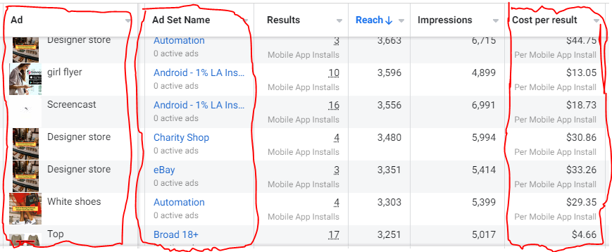
Once we knew what ad sets brought in what installs at what cost, we began optimizing and testing other interest groups and audiences, growing the profitable low CPI ones and eliminating the high CPI ones.
We did all our audience testing using an ABO campaign (Ad Set Budget Optimization), spending $10 to $30 on each ad set for three days and optimizing afterward. All ad sets under $30 were moved to a CBO campaign (Campaign Budget Optimization).
We let Facebook's AI decide how much to spend on each ad set, usually the one most likely to convert at the lowest cost.
If the CBO campaign maintains a nice CPI, we keep increasing the budget by $50 every few days or duplicating it sometimes in order to double the budget. This is how we've scaled to $400/day profitably.
Finding Successful Creatives
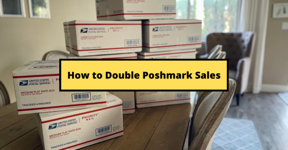
Per campaign, we tested 2-6 images/videos. Same ad copy and CTA. There was no clear winner because some images did better with some interest groups.
The image above with mail packages, for example, got us a cheap CPI of $9.71 from our Goodwill Stores interest group but, a high $48 CPI from our lookalike audience. Once we had statistically significant data, we turned off the high-cost ad.
New marketers who are just discovering A/B testing may assume it's black and white — winner and loser. However, Facebook ads' machine learning and reporting has gotten so sophisticated that it's hard to call a creative a flat-out loser, but rather a 'bad fit' for some audiences, and perfect for others.
You can see how each creative performs across age groups and optimize.
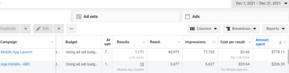
How Many Installs Did It Take Us to Earn $15K Per Month?
Six months after paying $25K, we got 1,940 app installs, 681 free trials, and 522 $30 monthly subscriptions. 522 * $30 gives us $15,660 in monthly recurring revenue (MRR).
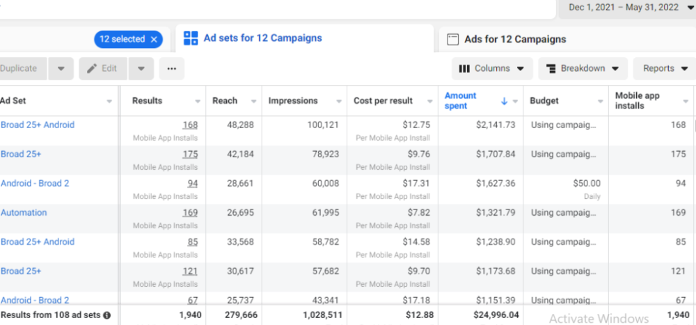
Next, what? $100K per month
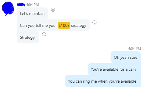
The conversation above is with the app's owner. We got on a 30-minute call where I shared how I plan to get the app to be making $100K a month like I’ve done for other businesses.
Reverse Engineering $100K
Formula:
For $100K/month, we need 3,334 people to pay $30/month. 522 people pay that. We need 2,812 more paid users.
522 paid users from 1,940 installs is a 27% conversion rate. To hit $100K/month, we need 10,415 more installs. Assuming...
With a $400 daily ad spend, we average 40 installs per day. This means that if everything stays the same, it would take us 260 days (around 9 months) to get to $100K a month (MRR).
Conclusion
You must market your goods to reach your income objective (without waiting forever). Paid ads is the way to go if you hate knocking on doors or irritating friends and family (who aren’t scalable anyways).
You must also test and optimize different angles, audiences, interest groups, and creatives.

cdixon
1 year ago
2000s Toys, Secrets, and Cycles
During the dot-com bust, I started my internet career. People used the internet intermittently to check email, plan travel, and do research. The average internet user spent 30 minutes online a day, compared to 7 today. To use the internet, you had to "log on" (most people still used dial-up), unlike today's always-on, high-speed mobile internet. In 2001, Amazon's market cap was $2.2B, 1/500th of what it is today. A study asked Americans if they'd adopt broadband, and most said no. They didn't see a need to speed up email, the most popular internet use. The National Academy of Sciences ranked the internet 13th among the 100 greatest inventions, below radio and phones. The internet was a cool invention, but it had limited uses and wasn't a good place to build a business.
A small but growing movement of developers and founders believed the internet could be more than a read-only medium, allowing anyone to create and publish. This is web 2. The runner up name was read-write web. (These terms were used in prominent publications and conferences.)
Web 2 concepts included letting users publish whatever they want ("user generated content" was a buzzword), social graphs, APIs and mashups (what we call composability today), and tagging over hierarchical navigation. Technical innovations occurred. A seemingly simple but important one was dynamically updating web pages without reloading. This is now how people expect web apps to work. Mobile devices that could access the web were niche (I was an avid Sidekick user).
The contrast between what smart founders and engineers discussed over dinner and on weekends and what the mainstream tech world took seriously during the week was striking. Enterprise security appliances, essentially preloaded servers with security software, were a popular trend. Many of the same people would talk about "serious" products at work, then talk about consumer internet products and web 2. It was tech's biggest news. Web 2 products were seen as toys, not real businesses. They were hobbies, not work-related.
There's a strong correlation between rich product design spaces and what smart people find interesting, which took me some time to learn and led to blog posts like "The next big thing will start out looking like a toy" Web 2's novel product design possibilities sparked dinner and weekend conversations. Imagine combining these features. What if you used this pattern elsewhere? What new product ideas are next? This excited people. "Serious stuff" like security appliances seemed more limited.
The small and passionate web 2 community also stood out. I attended the first New York Tech meetup in 2004. Everyone fit in Meetup's small conference room. Late at night, people demoed their software and chatted. I have old friends. Sometimes I get asked how I first met old friends like Fred Wilson and Alexis Ohanian. These topics didn't interest many people, especially on the east coast. We were friends. Real community. Alex Rampell, who now works with me at a16z, is someone I met in 2003 when a friend said, "Hey, I met someone else interested in consumer internet." Rare. People were focused and enthusiastic. Revolution seemed imminent. We knew a secret nobody else did.
My web 2 startup was called SiteAdvisor. When my co-founders and I started developing the idea in 2003, web security was out of control. Phishing and spyware were common on Internet Explorer PCs. SiteAdvisor was designed to warn users about security threats like phishing and spyware, and then, using web 2 concepts like user-generated reviews, add more subjective judgments (similar to what TrustPilot seems to do today). This staged approach was common at the time; I called it "Come for the tool, stay for the network." We built APIs, encouraged mashups, and did SEO marketing.
Yahoo's 2005 acquisitions of Flickr and Delicious boosted web 2 in 2005. By today's standards, the amounts were small, around $30M each, but it was a signal. Web 2 was assumed to be a fun hobby, a way to build cool stuff, but not a business. Yahoo was a savvy company that said it would make web 2 a priority.
As I recall, that's when web 2 started becoming mainstream tech. Early web 2 founders transitioned successfully. Other entrepreneurs built on the early enthusiasts' work. Competition shifted from ideation to execution. You had to decide if you wanted to be an idealistic indie bar band or a pragmatic stadium band.
Web 2 was booming in 2007 Facebook passed 10M users, Twitter grew and got VC funding, and Google bought YouTube. The 2008 financial crisis tested entrepreneurs' resolve. Smart people predicted another great depression as tech funding dried up.
Many people struggled during the recession. 2008-2011 was a golden age for startups. By 2009, talented founders were flooding Apple's iPhone app store. Mobile apps were booming. Uber, Venmo, Snap, and Instagram were all founded between 2009 and 2011. Social media (which had replaced web 2), cloud computing (which enabled apps to scale server side), and smartphones converged. Even if social, cloud, and mobile improve linearly, the combination could improve exponentially.
This chart shows how I view product and financial cycles. Product and financial cycles evolve separately. The Nasdaq index is a proxy for the financial sentiment. Financial sentiment wildly fluctuates.
Next row shows iconic startup or product years. Bottom-row product cycles dictate timing. Product cycles are more predictable than financial cycles because they follow internal logic. In the incubation phase, enthusiasts build products for other enthusiasts on nights and weekends. When the right mix of technology, talent, and community knowledge arrives, products go mainstream. (I show the biggest tech cycles in the chart, but smaller ones happen, like web 2 in the 2000s and fintech and SaaS in the 2010s.)
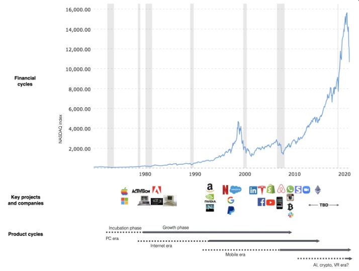
Tech has changed since the 2000s. Few tech giants dominate the internet, exerting economic and cultural influence. In the 2000s, web 2 was ignored or dismissed as trivial. Entrenched interests respond aggressively to new movements that could threaten them. Creative patterns from the 2000s continue today, driven by enthusiasts who see possibilities where others don't. Know where to look. Crypto and web 3 are where I'd start.
Today's negative financial sentiment reminds me of 2008. If we face a prolonged downturn, we can learn from 2008 by preserving capital and focusing on the long term. Keep an eye on the product cycle. Smart people are interested in things with product potential. This becomes true. Toys become necessities. Hobbies become mainstream. Optimists build the future, not cynics.
Full article is available here
You might also like

Boris Müller
1 year ago
Why Do Websites Have the Same Design?
My kids redesigned the internet because it lacks inventiveness.

Internet today is bland. Everything is generic: fonts, layouts, pages, and visual language. Microtypography is messy.
Web design today seems dictated by technical and ideological constraints rather than creativity and ideas. Text and graphics are in containers on every page. All design is assumed.
Ironically, web technologies can design a lot. We can execute most designs. We make shocking, evocative websites. Experimental typography, generating graphics, and interactive experiences are possible.
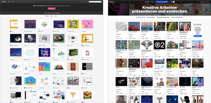
Even designer websites use containers in containers. Dribbble and Behance, the two most popular creative websites, are boring. Lead image.
How did this happen?
Several reasons. WordPress and other blogging platforms use templates. These frameworks build web pages by combining graphics, headlines, body content, and videos. Not designs, templates. These rules combine related data types. These platforms don't let users customize pages beyond the template. You filled the template.
Templates are content-neutral. Thus, the issue.
Form should reflect and shape content, which is a design principle. Separating them produces content containers. Templates have no design value.
One of the fundamental principles of design is a deep and meaningful connection between form and content.
Web design lacks imagination for many reasons. Most are pragmatic and economic. Page design takes time. Large websites lack the resources to create a page from scratch due to the speed of internet news and the frequency of new items. HTML, JavaScript, and CSS continue to challenge web designers. Web design can't match desktop publishing's straightforward operations.
Designers may also be lazy. Mobile-first, generic, framework-driven development tends to ignore web page visual and contextual integrity.
How can we overcome this? How might expressive and avant-garde websites look today?
Rediscovering the past helps design the future.
'90s-era web design
At the University of the Arts Bremen's research and development group, I created my first website 23 years ago. Web design was trendy. Young web. Pages inspired me.
We struggled with HTML in the mid-1990s. Arial, Times, and Verdana were the only web-safe fonts. Anything exciting required table layouts, monospaced fonts, or GIFs. HTML was originally content-driven, thus we had to work against it to create a page.
Experimental typography was booming. Designers challenged the established quo from Jan Tschichold's Die Neue Typographie in the twenties to April Greiman's computer-driven layouts in the eighties. By the mid-1990s, an uncommon confluence of technological and cultural breakthroughs enabled radical graphic design. Irma Boom, David Carson, Paula Scher, Neville Brody, and others showed it.
Early web pages were dull compared to graphic design's aesthetic explosion. The Web Design Museum shows this.
Nobody knew how to conduct browser-based graphic design. Web page design was undefined. No standards. No CMS (nearly), CSS, JS, video, animation.
Now is as good a time as any to challenge the internet’s visual conformity.
In 2018, everything is browser-based. Massive layouts to micro-typography, animation, and video. How do we use these great possibilities? Containerized containers. JavaScript-contaminated mobile-first pages. Visually uniform templates. Web design 23 years later would disappoint my younger self.
Our imagination, not technology, restricts web design. We're too conformist to aesthetics, economics, and expectations.
Crisis generates opportunity. Challenge online visual conformity now. I'm too old and bourgeois to develop a radical, experimental, and cutting-edge website. I can ask my students.
I taught web design at the Potsdam Interface Design Programme in 2017. Each team has to redesign a website. Create expressive, inventive visual experiences on the browser. Create with contemporary web technologies. Avoid usability, readability, and flexibility concerns. Act. Ignore Erwartungskonformität.
The class outcome pleased me. This overview page shows all results. Four diverse projects address the challenge.
1. ZKM by Frederic Haase and Jonas Köpfer
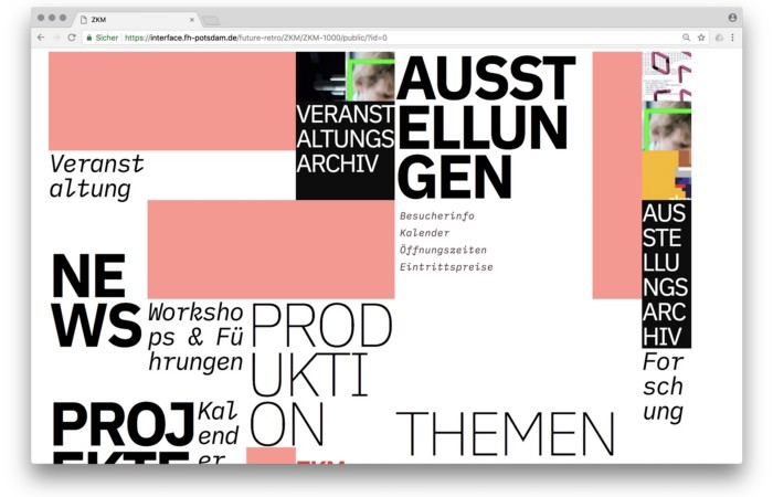
Frederic and Jonas began their experiments on the ZKM website. The ZKM is Germany's leading media art exhibition location, but its website remains conventional. It's useful but not avant-garde like the shows' art.
Frederic and Jonas designed the ZKM site's concept, aesthetic language, and technical configuration to reflect the museum's progressive approach. A generative design engine generates new layouts for each page load.
ZKM redesign.
2. Streem by Daria Thies, Bela Kurek, and Lucas Vogel
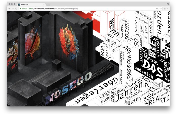
Street art magazine Streem. It promotes new artists and societal topics. Streem includes artwork, painting, photography, design, writing, and journalism. Daria, Bela, and Lucas used these influences to develop a conceptual metropolis. They designed four neighborhoods to reflect magazine sections for their prototype. For a legible city, they use powerful illustrative styles and spatial typography.
Streem makeover.
3. Medium by Amelie Kirchmeyer and Fabian Schultz
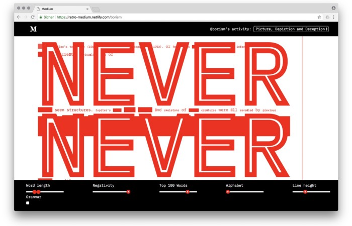
Amelie and Fabian structured. Instead of developing a form for a tale, they dissolved a web page into semantic, syntactical, and statistical aspects. HTML's flexibility was their goal. They broke Medium posts into experimental typographic space.
Medium revamp.
4. Hacker News by Fabian Dinklage and Florian Zia
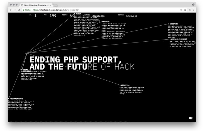
Florian and Fabian made Hacker News interactive. The social networking site aggregates computer science and IT news. Its voting and debate features are extensive despite its simple style. Fabian and Florian transformed the structure into a typographic timeline and network area. News and comments sequence and connect the visuals. To read Hacker News, they connected their design to the API. Hacker News makeover.
Communication is not legibility, said Carson. Apply this to web design today. Modern websites must be legible, usable, responsive, and accessible. They shouldn't limit its visual palette. Visual and human-centered design are not stereotypes.
I want radical, generative, evocative, insightful, adequate, content-specific, and intelligent site design. I want to rediscover web design experimentation. More surprises please. I hope the web will appear different in 23 years.
Update: this essay has sparked a lively discussion! I wrote a brief response to the debate's most common points: Creativity vs. Usability

OnChain Wizard
1 year ago
How to make a >800 million dollars in crypto attacking the once 3rd largest stablecoin, Soros style
Everyone is talking about the $UST attack right now, including Janet Yellen. But no one is talking about how much money the attacker made (or how brilliant it was). Lets dig in.
Our story starts in late March, when the Luna Foundation Guard (or LFG) starts buying BTC to help back $UST. LFG started accumulating BTC on 3/22, and by March 26th had a $1bn+ BTC position. This is leg #1 that made this trade (or attack) brilliant.
The second leg comes in the form of the 4pool Frax announcement for $UST on April 1st. This added the second leg needed to help execute the strategy in a capital efficient way (liquidity will be lower and then the attack is on).
We don't know when the attacker borrowed 100k BTC to start the position, other than that it was sold into Kwon's buying (still speculation). LFG bought 15k BTC between March 27th and April 11th, so lets just take the average price between these dates ($42k).
So you have a ~$4.2bn short position built. Over the same time, the attacker builds a $1bn OTC position in $UST. The stage is now set to create a run on the bank and get paid on your BTC short. In anticipation of the 4pool, LFG initially removes $150mm from 3pool liquidity.
The liquidity was pulled on 5/8 and then the attacker uses $350mm of UST to drain curve liquidity (and LFG pulls another $100mm of liquidity).
But this only starts the de-pegging (down to 0.972 at the lows). LFG begins selling $BTC to defend the peg, causing downward pressure on BTC while the run on $UST was just getting started.
With the Curve liquidity drained, the attacker used the remainder of their $1b OTC $UST position ($650mm or so) to start offloading on Binance. As withdrawals from Anchor turned from concern into panic, this caused a real de-peg as people fled for the exits
So LFG is selling $BTC to restore the peg while the attacker is selling $UST on Binance. Eventually the chain gets congested and the CEXs suspend withdrawals of $UST, fueling the bank run panic. $UST de-pegs to 60c at the bottom, while $BTC bleeds out.
The crypto community panics as they wonder how much $BTC will be sold to keep the peg. There are liquidations across the board and LUNA pukes because of its redemption mechanism (the attacker very well could have shorted LUNA as well). BTC fell 25% from $42k on 4/11 to $31.3k
So how much did our attacker make? There aren't details on where they covered obviously, but if they are able to cover (or buy back) the entire position at ~$32k, that means they made $952mm on the short.
On the $350mm of $UST curve dumps I don't think they took much of a loss, lets assume 3% or just $11m. And lets assume that all the Binance dumps were done at 80c, thats another $125mm cost of doing business. For a grand total profit of $815mm (bf borrow cost).
BTC was the perfect playground for the trade, as the liquidity was there to pull it off. While having LFG involved in BTC, and foreseeing they would sell to keep the peg (and prevent LUNA from dying) was the kicker.
Lastly, the liquidity being low on 3pool in advance of 4pool allowed the attacker to drain it with only $350mm, causing the broader panic in both BTC and $UST. Any shorts on LUNA would've added a lot of P&L here as well, with it falling -65% since 5/7.
And for the reply guys, yes I know a lot of this involves some speculation & assumptions. But a lot of money was made here either way, and I thought it would be cool to dive into how they did it.

Alexander Nguyen
1 year ago
How can you bargain for $300,000 at Google?
Don’t give a number
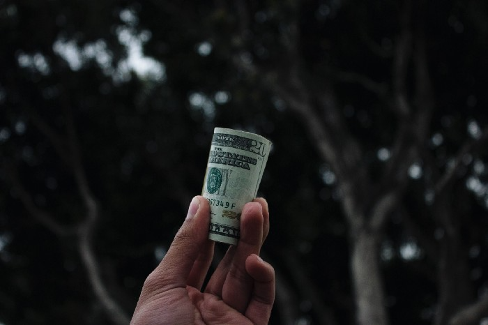
Google pays its software engineers generously. While many of their employees are competent, they disregard a critical skill to maximize their pay.
Negotiation.
If Google employees have never negotiated, they're as helpless as anyone else.
In this piece, I'll reveal a compensation negotiation tip that will set you apart.
The Fallacy of Negotiating
How do you negotiate your salary? “Just give them a number twice the amount you really want”. - Someplace on the internet
Above is typical negotiation advice. If you ask for more than you want, the recruiter may meet you halfway.
It seems logical and great, but here's why you shouldn't follow that advice.
Haitian hostage rescue
In 1977, an official's aunt was kidnapped in Haiti. The kidnappers demanded $150,000 for the aunt's life. It seems reasonable until you realize why kidnappers want $150,000.
FBI detective and negotiator Chris Voss researched why they demanded so much.
“So they could party through the weekend”
When he realized their ransom was for partying, he offered $4,751 and a CD stereo. Criminals freed the aunt.
These thieves gave 31.57x their estimated amount and got a fraction. You shouldn't trust these thieves to negotiate your compensation.
What happened?
Negotiating your offer and Haiti
This narrative teaches you how to negotiate with a large number.
You can and will be talked down.
If a recruiter asks your wage expectation and you offer double, be ready to explain why.
If you can't justify your request, you may be offered less. The recruiter will notice and talk you down.
Reasonably,
a tiny bit more than the present amount you earn
a small premium over an alternative offer
a little less than the role's allotted amount
Real-World Illustration

Recruiter: What’s your expected salary? Candidate: (I know the role is usually $100,000) $200,000 Recruiter: How much are you compensated in your current role? Candidate: $90,000 Recruiter: We’d be excited to offer you $95,000 for your experiences for the role.
So Why Do They Even Ask?
Recruiters ask for a number to negotiate a lower one. Asking yourself limits you.
You'll rarely get more than you asked for, and your request can be lowered.
The takeaway from all of this is to never give an expected compensation.
Tell them you haven't thought about it when you applied.